
Thursday, 27 January 2011

Thursday, 14 October 2010


Typography
 Increasing the leading so the text fits from top to bottom of the page makes it easier to read. I find the second column easier to read. When considering which is best it is a good idea to print the page off so you have a greater understanding of how it would turn out.
Typography
 What do you see first?
Thursday, 7 October 2010
Typography


Typography
 Same as the last task to read 1, 2, 3, 4 but the four has to be bigger than the other numbers.

Typography
 Another way which I thought was quite good, could use bold to thin or kerning to make the words wider as well.
Typography
 Trying to make the word One the first thing you look at then 2, 3 then 4. So you start from the bottom to the top
Typography


Monday, 4 October 2010
New York CAPITAL signs
Capital offenders: the case against uppercase
New York City is right to change the style of its street signs. Good, clear typography DOES NOT NEED TO SHOUT
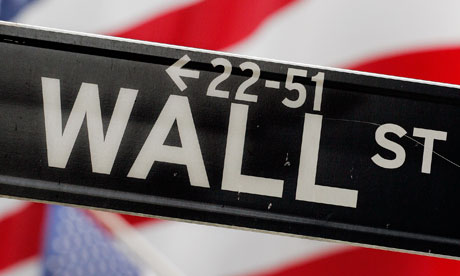
IT'S OFFICIAL: CAPITAL LETTERS CAN BE DANGEROUS.
At least, that's what the US federal highway administration believes. According to the New York Post:
"Studies have shown that it is harder to read all-caps signs, and those extra milliseconds spent staring away from the road have been shown to increase the likelihood of accidents, particularly among older drivers."
In New York City, this will mean replacing 250,900 street signs with signs that cap up only the initial letter. So BROADWAY will become Broadway. A new font, Clearview, has been developed for the purpose. Cost: $27.6m (although, to put that figure in perspective, 8,000 signs have to be replaced every year for $110 each through normal wear and tear).
Officials argue that the changes will save lives and the city's transportation commissioner, Janette Sadik-Khan, also suggested that the new signs might reflect a kinder, gentler New York. "On the internet, writing in all caps means you are shouting," she said. "Our new signs can quiet down, as well."
Despite hysterical Daily News coverage that said "several" New Yorkers were "outraged" by the change – it quoted three – the paper's own poll showed that two-thirds of the public is behind the switch from capital letters.
It won't surprise regular Guardian readers that I agree with them. TheGuardian style guide has long encouraged the gradual move away from capitals. So do other newspapers and websites, although some venerable style guides are still agonising over whether to lowercase internet and world wide web. (Be assured they will do so, perhaps in time for the 22nd century.)
In part, the switch from capitals reflects a society that is less deferential than in the days when the Manchester Guardian would write something like this: "The CHANCELLOR OF THE EXCHEQUER, Mr LLOYD GEORGE, presented the Naval Estimates to Ministers and Members of the House."
Most readers seem comfortable with a less formal style. A grand total of two people complained about our coverage of the pope's, rather than the Pope's, recent visit to the UK. We did receive a letter last week complaining that calling David Cameron the prime minister, not the Prime Minister (a style we have been following for more than a decade) reflected a "lowering of standards", but such complaints are few.
We need to be ever-vigilant, however, against the capital offenders. Politicians, civil servants and Estate Agents are three groups that remain intent on drowning us all in this alphabet soup. (Yesterday I was presented with a government statement that said: "On the Chancellor's recommendation the Prime Minister has appointed the Secretary of State for Energy and Climate Change to the Public Expenditure Committee ... ")
Capitals do have their uses, of course. As the Urban Dictionary puts it: "Capitalisation is the difference between 'I had to help my uncle Jack off a horse' and 'I had to help my uncle jack off a horse.'"
To return to traffic signs. New York's commendable decision is an echo of one taken in the UK 50 years ago, when the brilliant designers Jock Kinneir and Margaret Calvert, given the task of updating the country's chaotic system of road signs, concluded that "a combination of upper and lowercase letters would be more legible than conventional uppercase lettering". They produced a new font, known as Transport, which they felt would be friendlier and more appealing to British drivers than the stark modernist style used in continental Europe. The classic British road signage that they designed is still in use.
Thursday, 30 September 2010
Thursday 30th Typography
