Wednesday 30 March 2011

Impressions

A internet user spends on average 5 seconds before deciding whether or not to stay on the page or leave.

The following screenshots of websites are described in a few words but are what I instantly think of them.
Qubik Design - Doesn't say design in the image used, little text links hard to read.
A really bad example below of O.T.T - Evangle Cathedral
Apple - Slick, Sells products
LCAD Busy, information, hard to navigate, negative space, but BBC uses the same but uses negative space better
Olly Moss - index hibit - program, unfinished
Goslingo - boring, contradictory person
Hugh five - dull, simple, template, not bespoke
East Village - Hugh contrast, no hierachy
Stephen Caver - Impact, double tabs, maybe trying to hard, the columns are good.

OUGD203

START OF WEB

Thursday 10 March 2011

Other Music Apps


Just researching to see whether there are any other record label apps existing, if there are what do they feature, and make a list of their strengths.


Warp Identity


Looking at the colours used to apply to the app, important to keep the same identity. Also so if Rob's doing the app and I'm advertising we use the same guidelines. Typeface Helvetica/Arial.

App Layout for Download


National Rail

Buzz App

Advert Layouts Youtube, Last FM


Looking at the layout and sizes of the advertisements for Youtube and Last.fm

Music Apps


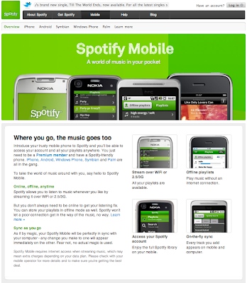
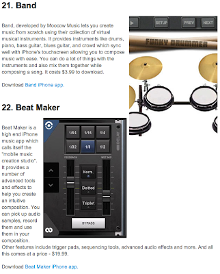
Looking at Music Apps Existing

Other music Apps


Looking at other music apps, I think that the last.fm app is as close to the same contents as what we would use for Warp Records app but try to make it look as good and offer something more/ improve.